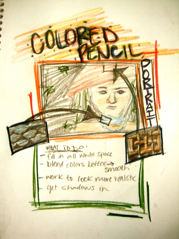
Colored Pencil Portait
Rubric |
|
|
Over All Project
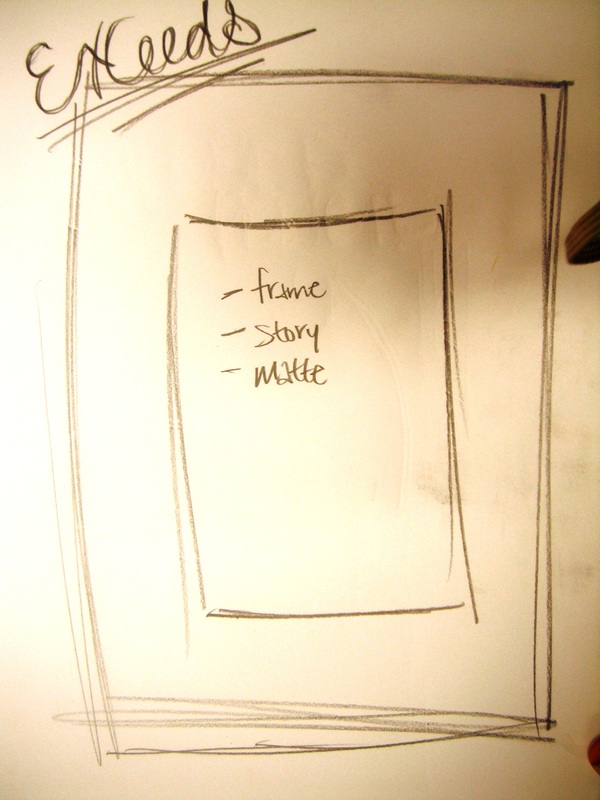
Exceeds- project is on time, completed, “nothing left to do with it”,looks realistic, good shades and values, good contrast of colors Meets- project is on time, has no white space Approaches- late, “finished” Below- late, unfinished Completion Exceeds- project is finished on time, “nothing left to do” Meets- on time, finished Approaches- on time Below- late Color Exceeds- good contrast, realistic colors, quality shading, many values Meets- paper is fully colored Approaches- white space left on the paper Below- poor shading, not completed Reflection1. Describe: What is your project? What materials did you use to make it? How long did it take you to make?
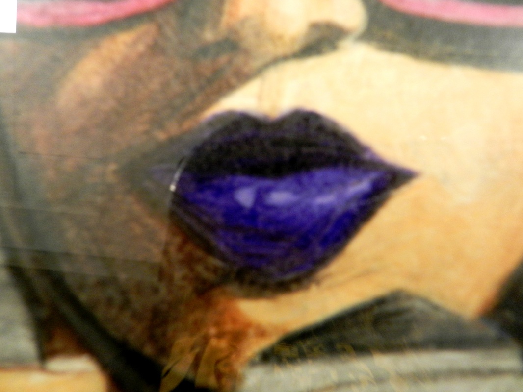
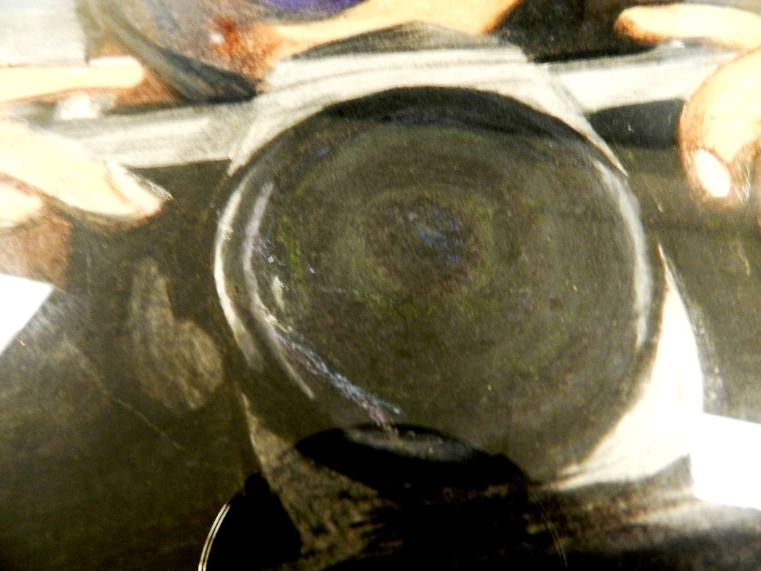
For my project, I drew two different portraits. I used a thicker paper and colored pencils. I worked on the girl with glasses over the course of two years when I had time and finished it up in the spring. Then I started the second one and finished it in august. 2. Evaluate: What are the good / strong parts of your project? What is done well and why? I think my portraits have strong contrast which makes things pop. I think the bold colors and the way the lines go turned out well. 3. Evaluate: What do you think you could have done better on this project and why? I think that I could have put a base down first before going straight into the bold coloring which might have made the skin look smoother. 4. Describe the attributes of yourtheme / unity: What is the deeper meaning of the project? What are you trying to communicate? What details did you use to reflect that theme? I feel like because both portraits have items in the picture (camera, hat with flowers, etc.) there is character and culture. It makes it seem like there is a story that goes along with them. 5. Describe the important elements used in your design (at least 2): What are the important elements? Why do you believe those are the most important? My designs have good shapes and contour lines, but especially contrast. 6. Describe the important principles (red-titled posters hanging in the art room) used in your design: What are the important principles? Why do you believe those are the most important? I feel like both of my portraits have good unity. The girl with the hat has good dominant color with the repetition of purple flowers. The girl with the glasses has good balance; the background isn’t too distracting. 7. Metacognate: What did you learn from this project that you could apply to other projects in the future? What lessons could be applied to life in general? Why? I learned that the harder you color the bolder the picture is not just the colors. To color pictures like that you almost have to take breaks because your hand cramps and I actually got blisters. 8. Evaluate and list the design process of your project. First, I made preliminary sketches and then actually sketched them. Next, I decided the colors I would use and began color. I started with basic tones and gradually, as I got color down, I added details and value. 9. Why did you do the project the way you did? Was it planned? What is by chance? What changes did you have to make along the way (if any changes were necessary)? I have learned that sketching first works pretty well so that’s how I began. I came across these pictures and decided to replicate them. The girl with the glasses was supposed to be a blonde and the girl with a hat was supposed to be looking at you. 10. Was this a worthwhile project for yourself and why? What project will you be doing next and why? I feel like this project was worthwhile because I learned a lot and I am pleased with the final project. For my September project, I am going to finish the charcoal mural that I began this summer. |
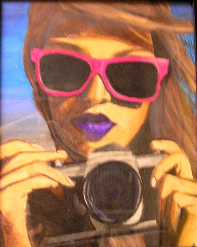
Girl With Glasses
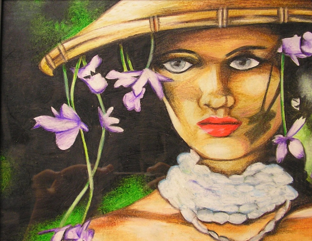
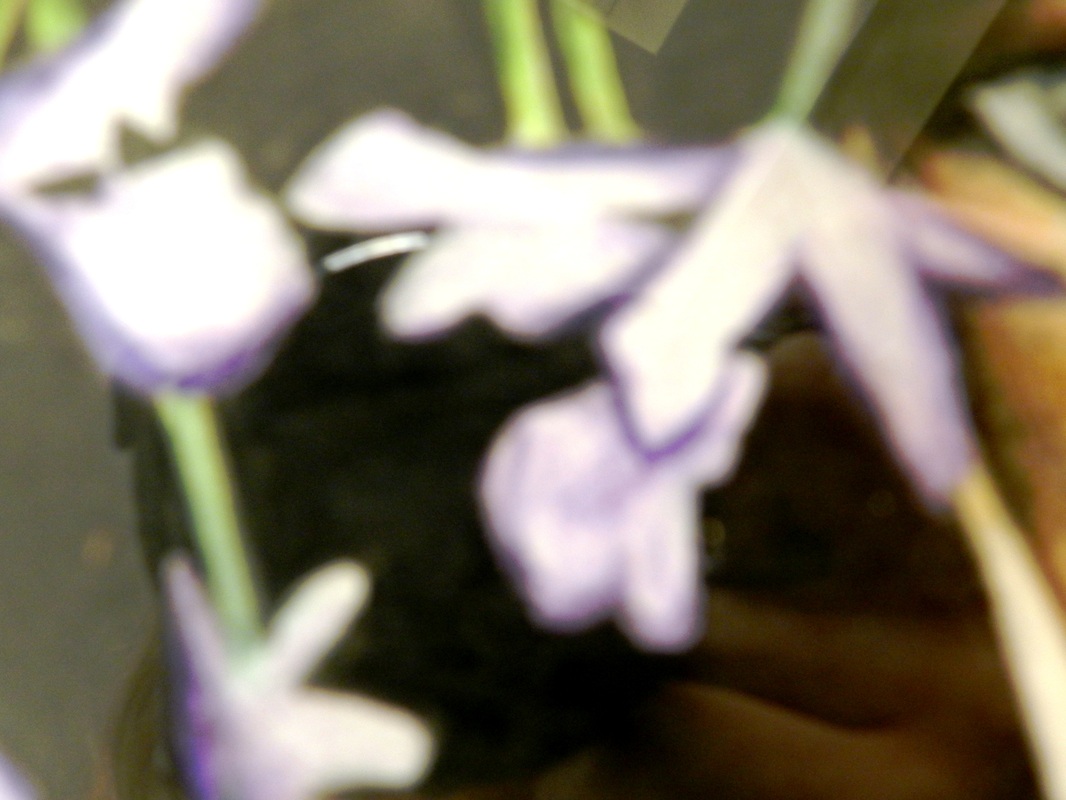
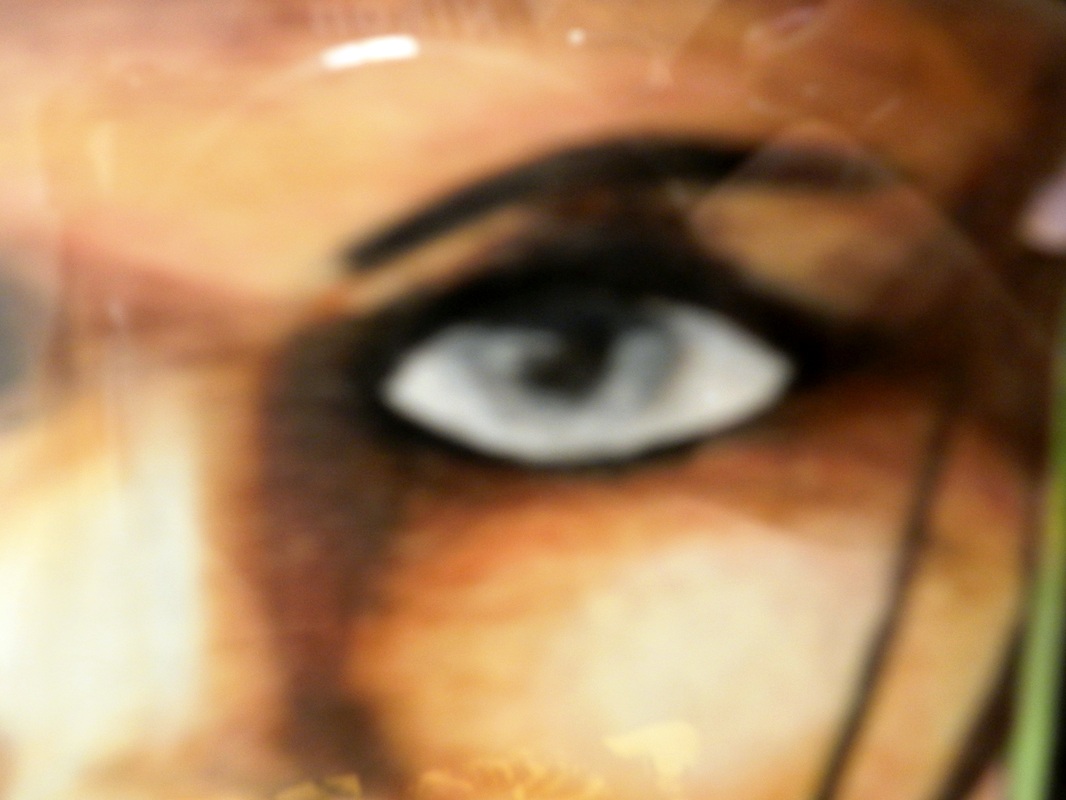
Girl Wearing A Hat
|